
A brief history of Dazzle
Dazzle paint was developed by the artist Norman Wilkinson and used on ships in the First and Second World Wars to confuse the eyes of the enemy. Dazzle isn’t camouflage: it was realised very early on that it would be impossible to give a ship one paint scheme that would hide it in all the environments it would sail through. Instead, the geometric shapes made it difficult to visually assess the class, distance, position and movement of ships, thereby making it difficult to target. Thus the term “Dazzle” or “Razzle Dazzle” was used to describe the paint schemes.
Prior to the 20th Century, ships were painted with decorative designs. They were commonly black with red, white and gold accents. From 1905, the Royal Navy began painting their ships grey. The marine artist Norman Wilkinson came up with the theory that the appearance of a ship could be altered by painting it in high contrast colours. Angular lines were used to make the work of a range finder difficult. Funnels and gun turrets positioned near each other would be painted in contrast to make it difficult to recognise a ship by its profile. The Admiralty questioned the efficacy of the dazzle schemes, but kept them in place because it’s said ships crews believed whole-heartedly in them.
Between the wars, ships returned to being painted in single toned greys and white, but when war broke out in 1939 the Admiralty once again began experiments with deceptive colour schemes. In 1942, a Fleet Order was published, laying out the different colours ships could use, though there was no guidance on patterns. Many ships designed their own. A Directorate of Camouflage was established to create special designs for ships. Then in 1943, a handbook including the theory of camouflage, patterns and paints was published. It included paint schemes for a range of Admiralty vessels from destroyers to coastal vessels. The Directorate of Camouflage continued to design schemes for special ships and aircraft carriers.
The dazzle schemes played with light and dark and the most common tones were chosen to match colour naturally occurring in the sea and sky: greens, blues and greys. Ships were painted with anywhere from two to seven different tones, the idea being that at least one tone might look ‘invisible’ in certain lights and weather conditions. The concept of counter shading was also used: parts of the ship that would naturally be shaded – under guns and overhangs – were painted bright white so as to hide the shape of the shadow. The same principle was used in reverse for parts that were usually cast in light. Tops of gun barrels would be painted in darker shades than the bottoms. White was usually used for masts, because white would blend in with the sky in many situations. The decks of ships were also painted, to disguise it when the ship was listing heavily. All parts of ships tended to be painted, from funnels to guns to boats.


More to explore.

First Aid at Sea in the Second World War
Medical personnel played a vital role at sea during the…
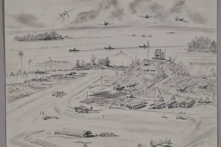
The Wartime Artwork of Owen (Miles) Spence
A selection of drawings from Owen (Miles) Spence from the…

The scuttling of the Graf Spee video
Short video of the scuttling of the Battleship the Admiral…

A sailor’s diary – Battle of Kolombangara
AB Johnstone remembers the Battle of Kolombangara in his diary.

Minesweeper’s Gloves
Minesweeper’s gloves were made by home crafters and sent to…
")
Operation Struggle
Midget submarine XE3 carried out a successful attack on a…

Signalling Victory and Survival
White Ensign made by New Zealanders in a Japanese POW…

Suitcase with a story
This small brown suitcase has a fascinating story from WW2.

Wrens
Brief history of women’s war service in New Zealand Navy.

Cup and Saucer
Cup and saucer from ‘Paragon Patriotic’ series World War Two.

Images from Battle of the River Plate
Gallery of images from the Battle of the River Plate.

Torpedo Sight
The torpedo sight improved the accuracy of firing torpedoes.

Surrendered Treasure
Japanese naval dirk (dagger) that was surrendered to LT CDR…

Remembering a Naval Hero
LT CDR Macdonald invented torpedo sight for motor torpedo boats.

Nurse’s Uniform
Royal New Zealand Nursing Corps World War Two uniform.

Gloves
Gloves used for handling mines in WW2 issued to S/LT…

Veteran shares memories
WW2 veteran Brian Breen remembers his time in HMNZS Leander.

Remembering the Battle of Kolombangara
HMNZS Leander saw action in Battle of Kolombangara.

Images Battle of Kolombangara
Images from Battle of Kolombangara of Leander crew July 1943.

Medal mystery
Collections team solves a medal mystery that links two sailors.

Treasured letters
Treasured letters from a lost love serving in HMS Neptune.

Make and Mend
During Make and Mend once a week sailors repaired uniforms.
")
Dazzle ships
Dazzle was developed to confuse the eyes of the enemy.

Japanese I-1 Gun
Gun recovered from the I1 Japanese submarine.

Leander
HMNZS Leander saw active service in World War Two.